INDUSTRY:
SMB SUBSCRIPTION MANAGEMENT
COMPANY:
NANOPAY
YEAR:
2022
MY ROLE:
UX DESIGNER
Virtual Cards & Subscription Management
I led design on Cards, nanopay's virtual card and subscription management product for SMBs and sole proprietors. Most small businesses are paying for software they've forgotten about, at prices that changed quietly, on cards they share across a dozen services. Cards gave users a dedicated virtual card per subscription with automated deposit scheduling and spending controls. The whole thing was designed around one principle, the less input it requires, the better.
challenge.
Most SMBs don't have a system for managing subscriptions. They have a credit card statement they look at when something feels wrong. By then, they've usually been paying for something unused for three months.
nanopay saw a gap: build a virtual card product on existing payment rails and go after the SMB segment spending $100+ per subscription with around 20 transactions a month. The target was 2,500 active businesses by month 12.
I talked to 8 SMB owners during discovery. Three things came up constantly. They didn't know what they were paying for until the bill arrived. They couldn't stop a renewal without cancelling the whole account. And they were spending time every month just auditing spend that should be automatic.
process.
I worked with another designer and the PM to lead the design direction from discovery through prototyping and into MVP iterations. I also worked on competitive analysis across Privacy.com, Brex, and Revolut Business, and looked at subscription tracker apps separately.
Design Principles
Before working on wireframes and design I ran a session with the PM and engineering leads to agree on three design principles. These ended up being more useful than any review session during the project. The principles were:
Hands Off. The platform has to be a minimal-input system. If users need to actively manage it, the product has failed. This drove automated scheduling and smart defaults throughout.
Subtle. The virtual cards are the hero of the product. The UI around them had to step back. This became a key part of the visual direction too.
Transparent. Subscription services use dark patterns. We committed to making every charge, price change, and renewal moment visible and comprehensible.
key design decisions.
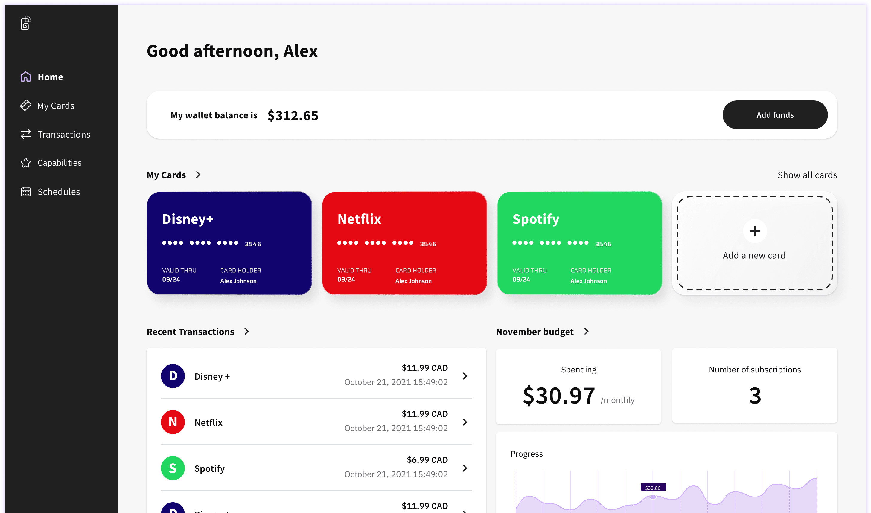
Dashboard
The dashboard needed to show wallet balance, active cards, recent transactions, and budget at once without turning into a data dump. I treated each virtual card as a first-class element with its own visual identity, colour-coded by service. Cards anchor the screen. Everything else is secondary context under them. In usability testing, users understood which card belonged to which service without needing labels.
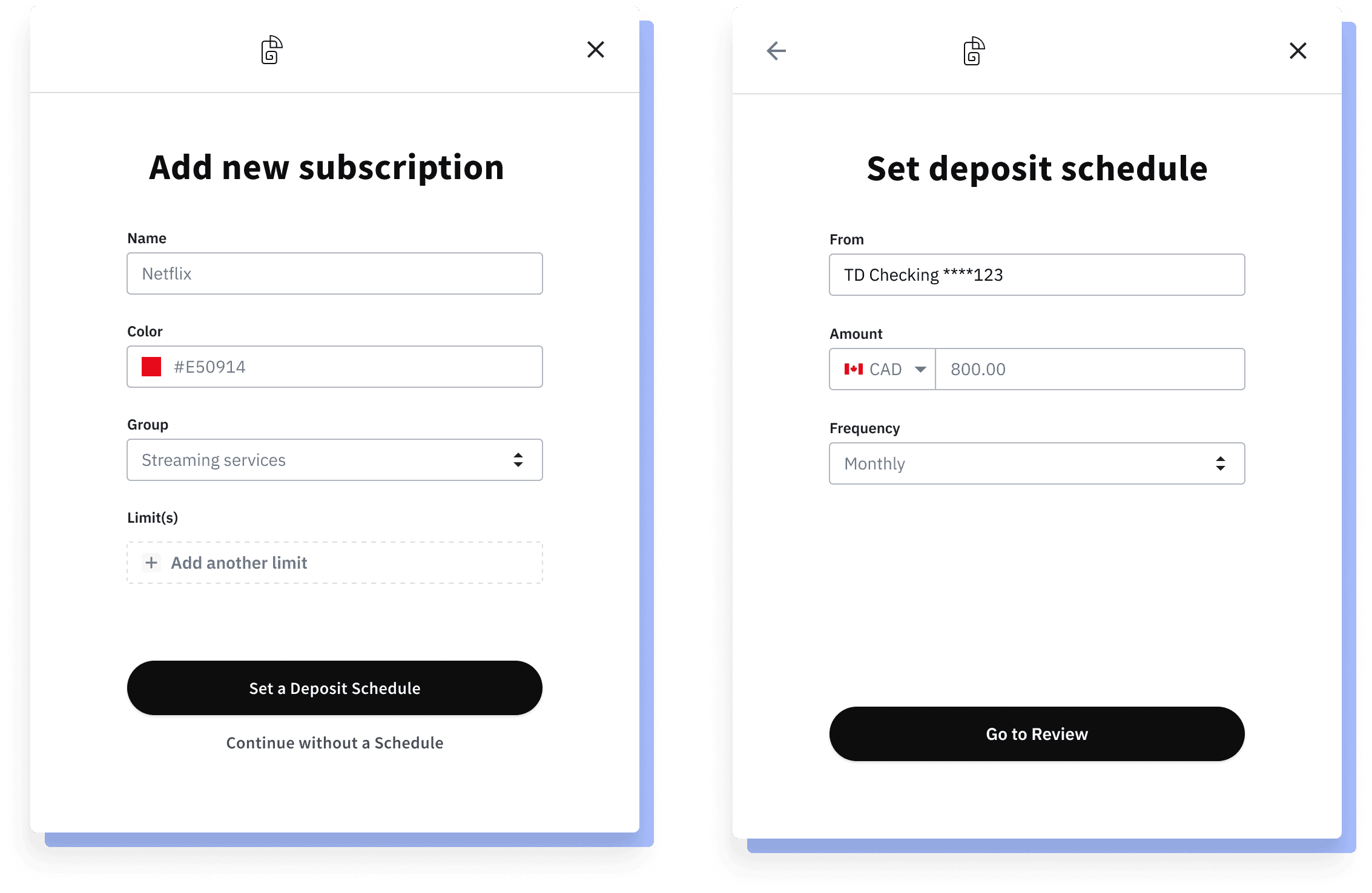
Card Creation
Early prototypes asked users to configure too much upfront. I redesigned with progressive disclosure: name the card and set a group first, then optionally add spending limits and a deposit schedule. The common case, a simple monthly subscription, takes under 60 seconds. Power users can configure advanced schedules without that complexity being in anyone else's way.
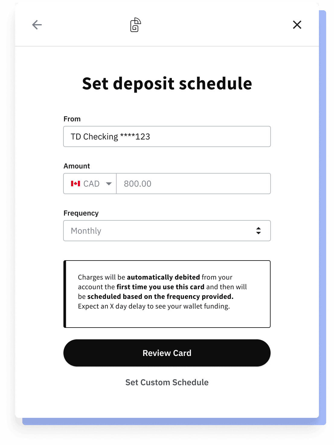
Deposit Scheduling
This was the most contested part of the design. V1 was intentionally simple: pick a frequency, done. During usability testing we found some SMB owners with irregular cash flow needed more control, so V2 introduced a full custom scheduler with day-of-week selectors, repeat intervals, and month-day pickers.
V1: Simple scheduling for deposits
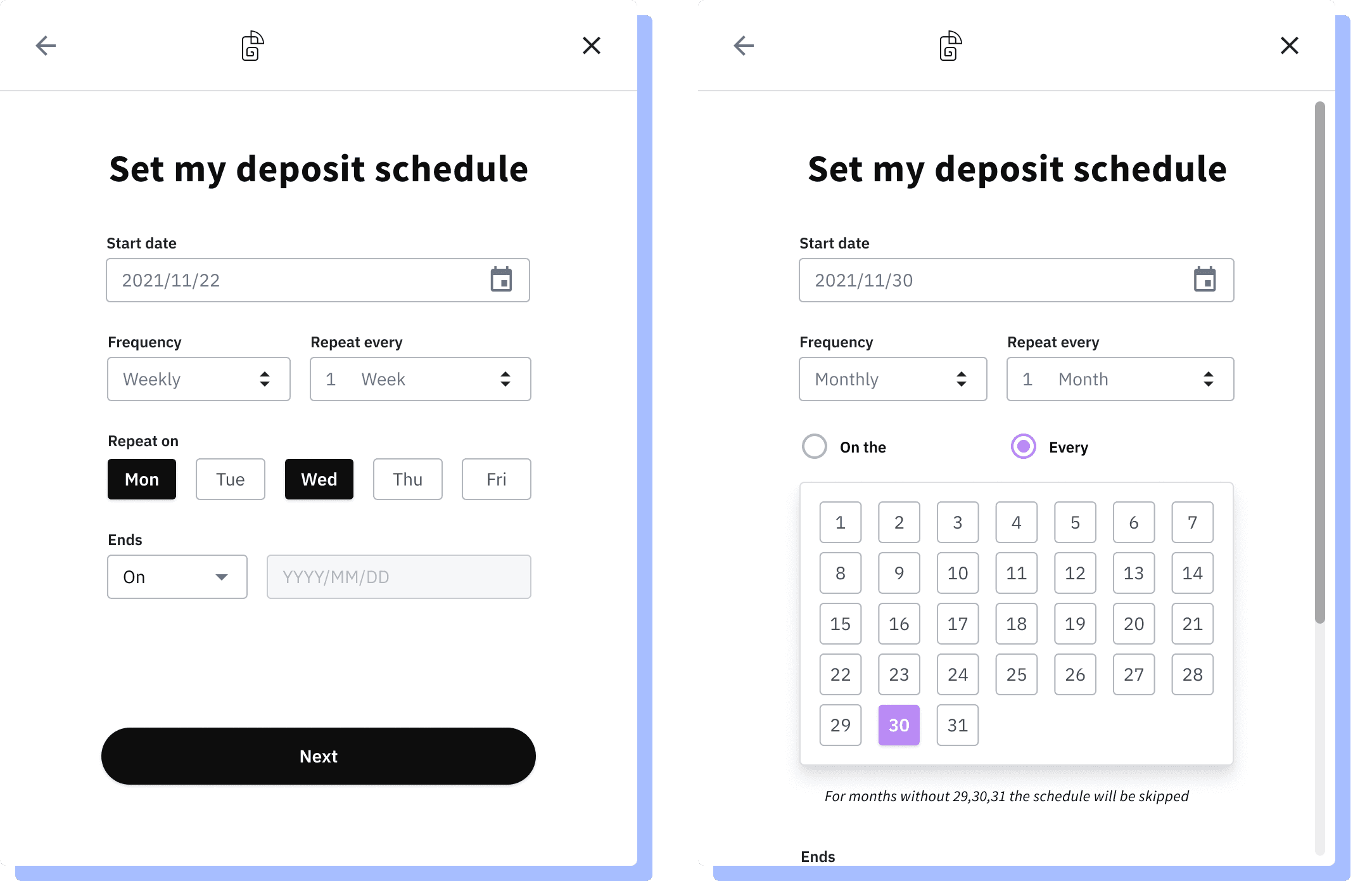
V2: More customizable scheduling for power users.
It tested well with power users and confused everyone else. 3 out of 5 participants froze at the calendar without interacting. One said: "I just want it monthly, I don't need all this."
MVP: Iteration three gave us the best of both worlds keeping quick actions easy but still providing customizability where needed.
The fix was to separate the two user types clearly. The default flow is a simple three-field form. "Set Custom Schedule" is a secondary action that reveals the advanced options only for people who want them. It took two rounds of testing to separate the two user types. I should have done that from the start.
Card Management
Edit, pause, and delete live in a contextual dropdown on each card. The key insight from research: users usually don't want to cancel a subscription permanently. They want to pause it. Adding "Pause Card" as a distinct action, not buried in settings, reduced the cognitive weight of taking action.
result.
The product didn't ship as the unit economics didn't close. The design held up in testing though: simplified scheduling cut drop-off in card creation, and the color-coded card system was understood without labels. The scheduling component was in fact reused in a future nanopay product, Foree Remittance.

